Agisoft Metashape is one of the most widely used photogrammetry software tools for creating orthomosaics, 3D models, and geospatial data products from aerial imagery. While most users focus on camera alignment, dense cloud generation, and orthomosaic stitching, one crucial yet often overlooked step can significantly impact the quality of your final deliverable: adjusting brightness and contrast before export.
Proper brightness and contrast adjustments ensure that your orthomosaic is not only geometrically accurate but also visually consistent and usable for GIS analysis, presentation, or client reports. In this guide, we’ll explore why this step is so important, how to apply it correctly in Agisoft Metashape, and best practices to achieve professional-quality results every time.
Why Brightness and Contrast Matter in Orthomosaic Exports
Orthomosaics generated from drone imagery are more than just stitched aerial photographs — they are georeferenced raster datasets that must balance visual clarity with scientific accuracy. Even if your orthomosaic is perfectly aligned and georeferenced, poor tonal balance can make it difficult to interpret or present.
Here’s why brightness and contrast adjustments matter:
- Improved visibility of surface features: Subtle ground details such as crop rows, erosion patterns, or infrastructure edges become more visible when tonal range is optimized.
- Enhanced data interpretation: GIS analysts rely on visual cues to digitize features or interpret land cover. Proper contrast helps prevent misinterpretation.
- Consistency across projects: Adjusting tonal values ensures multiple orthomosaics from different flights or dates match visually, which is essential for time-series analysis.
- Professional presentation: Delivering a final product that is both accurate and visually polished improves client satisfaction and project credibility.
Without brightness and contrast adjustments, orthomosaics can appear washed out, overly dark, or inconsistent — especially when captured under varying light conditions.
Where and How to Adjust Brightness & Contrast in Metashape
Agisoft Metashape provides built-in tools for brightness and contrast adjustment at the export stage, allowing you to fine-tune the final raster without altering the underlying data. This is particularly useful because it applies the tonal changes non-destructively and only to the exported orthomosaic.
Here’s a step-by-step guide:
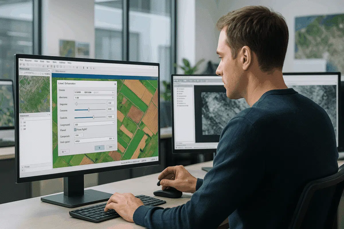
- Once your orthomosaic is generated, navigate to File > Export > Export Orthomosaic.
- In the export dialog, you’ll see an option for Brightness and Contrast.
- Use the sliders or input fields to adjust brightness (overall lightness) and contrast (difference between light and dark areas):
- Brightness: Increase slightly (+5 to +15) if the orthomosaic is too dark, or decrease if it appears overexposed.
- Contrast: Boosting contrast (+10 to +20) enhances feature visibility but avoid extremes that may clip details.
- Preview the changes using the built-in visualization before finalizing the export.
- Choose your output format (e.g., GeoTIFF, BigTIFF) and complete the export.
This workflow ensures your orthomosaic maintains its original spatial accuracy while delivering a visually optimized final product ready for analysis or publication.
Best Practices for Optimal Results
Brightness and contrast adjustments should be subtle, precise, and guided by the context of your project. Here are several expert tips to get the best results:
1. Calibrate Your Monitor
Visual adjustments are only as good as the screen you’re viewing them on. A calibrated monitor ensures that what you see during editing is consistent with how others will see the final export. If your monitor is too bright or too dark, you might overcompensate with your adjustments.
2. Avoid Overcorrection
It’s tempting to push contrast for a more dramatic image, but excessive contrast can distort pixel values and obscure subtle details. Keep adjustments modest — typically within ±20 — to maintain natural-looking results and scientific integrity.
3. Consider End Use
If your orthomosaic is destined for GIS analysis, prioritize tonal balance that reveals subtle features. If it’s primarily for presentation or client reports, you can favor slightly higher contrast for better visual impact.
4. Use Histogram Analysis
Before exporting, analyze the raster histogram (available in most GIS software or image viewers). A well-distributed histogram without excessive clipping at the ends indicates a balanced image with full tonal range.
5. Batch Processing for Consistency
When exporting multiple orthomosaics from the same project or monitoring campaign, use the same brightness and contrast values for all exports. This ensures visual consistency across datasets — especially important for time-lapse analysis or large mosaicked projects.
Advanced Techniques: Post-Processing in GIS or Image Software
While Metashape’s built-in adjustments are often sufficient, advanced users may want even more control. In such cases, exporting the orthomosaic with neutral settings and performing tonal corrections in specialized software can yield superior results.
Recommended workflows include:
- QGIS: Use raster style settings to adjust brightness and contrast dynamically, or reprocess the raster with the Raster Calculator for permanent changes.
- Photoshop / GIMP: For presentation-focused projects, apply curves and levels adjustments to fine-tune tonal response without altering georeferencing.
- GDAL: Use command-line tools like
gdal_translatewith color interpretation options for automated brightness and contrast corrections across large datasets.
These techniques offer greater flexibility but require additional steps. For most workflows, Metashape’s export dialog provides an excellent balance of simplicity and control.
Common Mistakes to Avoid
Even experienced users can make errors when adjusting brightness and contrast. Here are a few pitfalls to watch out for:
- Adjusting before alignment: Always complete image alignment, dense cloud generation, and orthomosaic building before applying tonal adjustments. Early changes can lead to inconsistent results.
- Ignoring light conditions: If your dataset includes images captured under variable lighting (e.g., partly cloudy conditions), brightness and contrast may need extra fine-tuning or even radiometric calibration before export.
- Clipping important data: Pushing contrast too high can eliminate subtle differences in vegetation, soil, or water surfaces, reducing analytical value.
By being aware of these issues, you’ll avoid common quality pitfalls and produce orthomosaics that are both visually and scientifically robust.
Conclusion: Perfecting Orthomosaic Quality with Tonal Adjustments
Adjusting brightness and contrast in Agisoft Metashape is a simple but powerful step that can elevate your orthomosaic exports from technically correct to visually outstanding. Whether you’re delivering high-resolution geospatial data for analysis or creating presentation-ready imagery for clients, fine-tuning tonal values ensures that every detail is clearly visible and accurately represented.
By following the techniques outlined in this guide — from subtle slider adjustments in the export dialog to histogram analysis and advanced post-processing — you can deliver professional-grade orthomosaics with confidence. It’s a small step that makes a big difference in the final quality of your photogrammetry projects.
Ready to take your Metashape exports to the next level? Experiment with brightness and contrast on your next project and see how much more impact your orthomosaics can have — visually and analytically.